Published 2025-04-15
tag(s): #programming #emacs
I think I should have included the "useless facts" tag. The next best thing I can do is say
up front that there's no good reason. I got curious enough to give it a try.
Well, actually...there is a reason. I don't know if it's a good one, and at the end of the
day, it's more of an excuse than a "reason".
Quite some time ago (a few years, even?)[1] I was looking for a new Emacs theme either in the now defunct peach-melpa.org, or Emacs Themes. There aren't that many light background themes, and at some point I landed on Plain Theme, in its README has a link to this article:
A case against syntax highlighting
My initial reaction was that this was silly, and reading the comments most people reacted the
same way. But the idea was planted like a seed and over time I came back to it.
What if there is no highlighting? How would that help anything? But...we didn't always
have coloring and people wrote code anyway, it is REALLY necessary? Isn't that a slippery
slope of "eschew all nice things"?
With my quest
to simplify my
configuration[2], I started being a bit more mindful about how each
package and command added affected my use of the editor.
I noticed that when I work in a remote shell, a lot of times I don't have syntax highlighting
and I can do things just fine, watering that old seed some more.
Also once again,
(as it happened
for completion) I took inspiration from some people at work, using a more stripped down
setup, while being very efficient in their workflows.
I wanted to give the experiment a try, so over a few days I tried about 10 themes, for example Almost Mono, Plain, and the one that came closest to what I wanted, Tok Theme.
But in all of them I found little touches of accent color that I disliked, or heavy use of
bold and italic to replace colors. Tok was by far the closest to my ideal, and the code for it
was very easy to read, no macros or funky constructs, just some color declarations and that
was it.
So of course I thought "hey I can do my own variation".
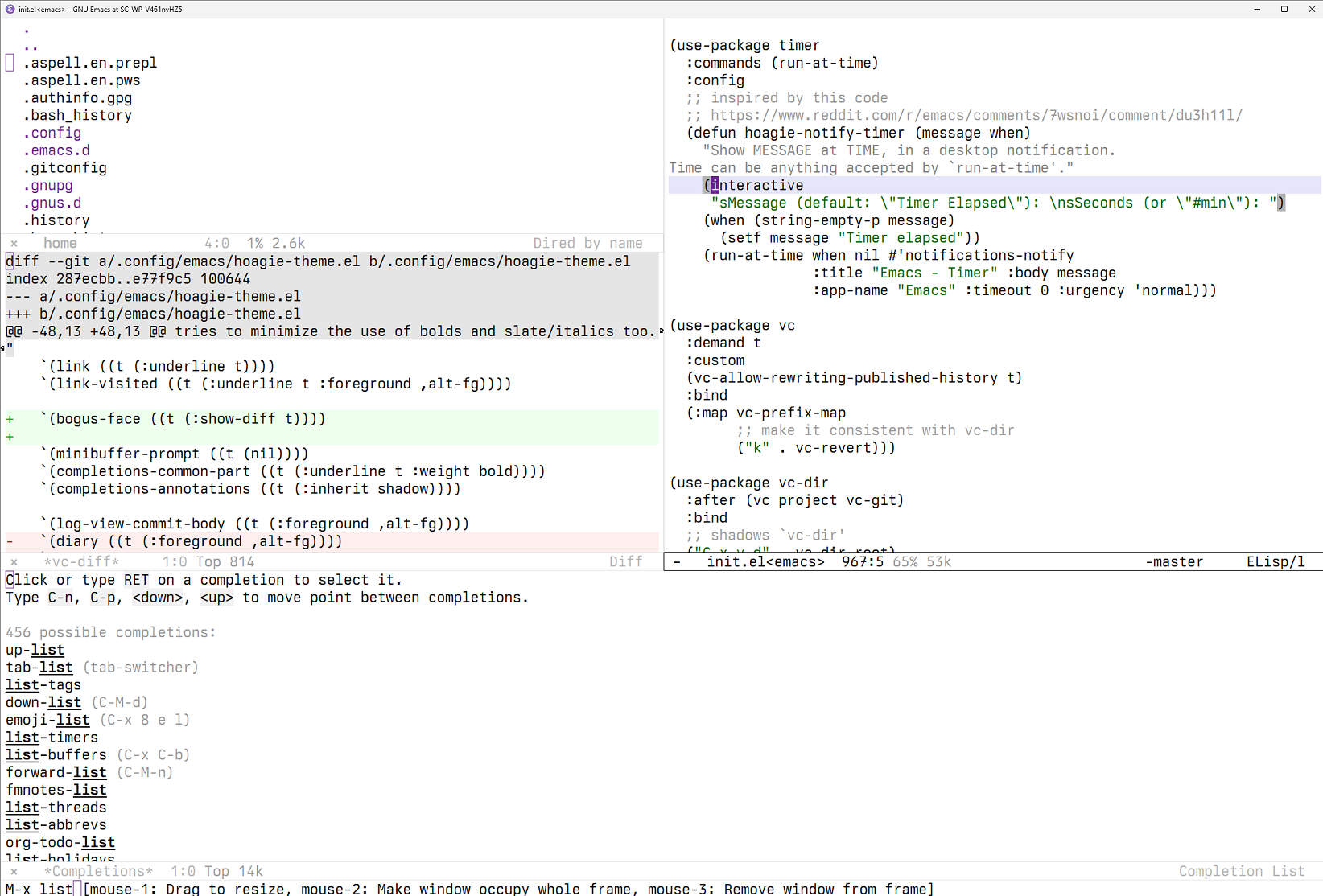
As you can see, there's very little use of color. White background, black letters. Bold and
underline used as little as possible. No italics.
There's a palette of greys, inherited from Tok, with one "even milder" grey added. Two accent
colors, dark violet and dark green. A light "lavender" for hl-line.
For font-lock, the only colors used are light grey for comments, and dark green
for strings. Everything else is plain.
Why violet and green? No particular reason, but it is clear I like this combination:
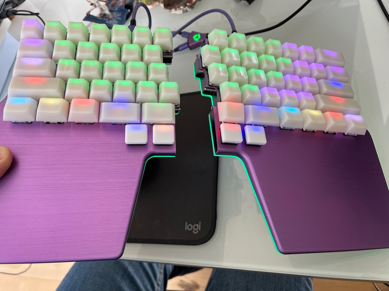
That's my Dygma Raise. I would say 10% of why I didn't get a Raise 2 is because they don't
come in purple (the other 90% is the price 🤡). Other layers use different colors as "base",
but the default one is green alpha & num keys, with green underglow.
I got a DualSense game pad couple weeks ago. Of course I picked a color I liked, they have
quite the variety. Then I found an option in Steam to change the LED color, I played a bit
with it. A few nights later, I turned the pad on and realized...

...that I had absent-mindedly replicated the Raise color scheme.
While "dark green for strings" was an early feature of the theme, the second accent color was
a subtler blue at first. I used green for directories in Dired in v1, but that made them
highlight too much (given the rest of the "palette"). That's when I settled on light blue as
"subtler accent color", and from there I moved to something darker...and here we are. Now
dired's look is more mmmmm uniform?
Yes and no.
No, because nothing magical happened. It didn't increase my "code awareness", or made me
slower to read code, or faster, or...anything.
Yes because of the same things I said above. It really makes little to no difference. Which in
a way helps the cause of the article that started this experiment. But at the same time, I
could have not created a new theme and there would be no difference, so it
contradicts the article too???
As it stands now, I see syntax highlighting as a non-feature.
Still, now I am attached to the theme, I won't go back to modus-operandi, at least for a
long while. And it's nice that I understand Emacs faces a lot better now.
On that note, I started thinking I didn't need to define a lot of faces, but the theme keeps
getting bigger. Just writing this article, I checked a word in the dictionary and the faces
needed adjustment.
In case you are curious, the theme is in Source Hut, with the rest of my dotfiles.